Deloitte Digital Italy
Six months embedded in an enterprise design team, on live client
work across e-commerce, insurance and cultural heritage.
The main engagement was a conversion assessment
for a global consumer brand, run on a weighted evaluation
framework with evidence behind every recommendation.
Note
Client work under NDA. Identities anonymised, artefacts
blurred. Everything shown here is redrawn or obscured;
happy to talk through the specifics in person.
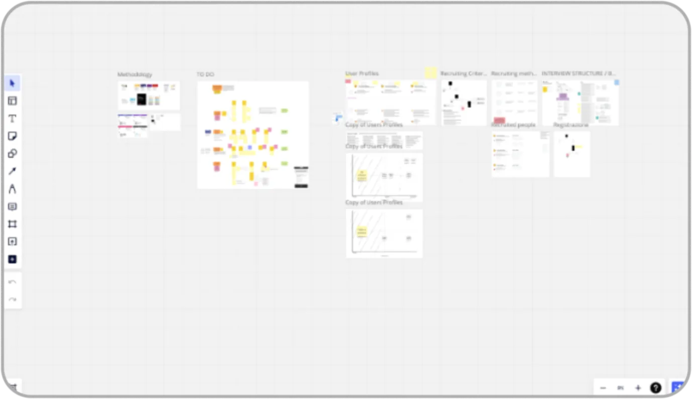
The engagement board in Miro – phases,
governance, and analysis workspace.
Blurred to protect client material; the scale
of the process is the point.
1 / What it had to do
The client's question was commercial, not aesthetic: why isn't
the website converting, and what should change? The answer
had to survive scrutiny from stakeholders who think in KPIs,
which rules out the two things a designer normally reaches
for – a redesign, and an opinion. Not a classroom internship:
real engagements, real clients and real deadlines inside
a consulting delivery model with project managers, senior
designers and client stakeholders.
2 / The idea
Evidence is the deliverable. What separated this from a student
heuristic review was the instrument: the client and its competitors
were scored through a weighted framework of five areas,
each broken into indicators with defined criteria
and a weight toward the total. Every score carried
the screenshot it came from, and every recommendation
carried a reference. Nothing rested on taste.
3 / How
the engagement ran
Five phases over eight weeks; I worked inside the two in the middle.
In the analysis phase I scored the client's site and its competitors
against the framework, screenshot by screenshot in Miro,
annotating each score with the evidence behind it,
then synthesised the findings into a best-practices library –
each practice illustrated from the benchmarking and explained
in terms of the indicator it improves — and validated every
one of them against Baymard Institute guidelines.
In the testing phase I contributed to persona definition
and to interview scripts built like narratives, with timed
sections, purpose notes and fallback questions, plus recruitment
and scheduling.
Session roles were assigned in advance: interviewer, primary
note-taker, backup note-taker. I was primary note-taker
on a session run in English, which meant the analysis
was built from what I captured.
Afterwards we clustered the pain points into four groups
and mapped every cluster onto the user journey, to show exactly
where the experience was leaking conversion.
- Weighted framework
- Competitor benchmarking
- Baymard validation
- Moderated testing
- Pain-point clusters
- Journey mapping
The five phases
Week 1
Kick-off & governance
Milestones, stakeholder map, approach detailed
and agreed with the client.
Week 2-3
Expert analysis
Weighted framework evaluation, Core Web Vitals, competitor benchmarking, issue list.
Week 3-4
Interviews & testing
Persona definition, scripted sessions,
moderated usability testing, findings
report.
Week 5-6
Hypothesis definition
Key scenarios, evolution hypotheses, KPI framework, prioritised roadmap.
Week 6-8
Presentation
Slide templates and the final
presentation to the client.
Blue marker = the phases I worked in
What the testing found
01
Registration friction as a purchase barrier
Mandatory account creation interrupted
the path to purchase at its most fragile
moment.
02
Value proposition not captured
Users couldn't articulate back what
made the offer distinct. The message
wasn't landing.
03
Information hard to access
Key content existed but was perceived
as buried — a findability problem,
not a content problem.
04
Technical issues degrading UX
Interface-level defects compounding
into distrust at decision moments.
Four clusters, each mapped onto the user journey
so the client could see where conversion was leaking.
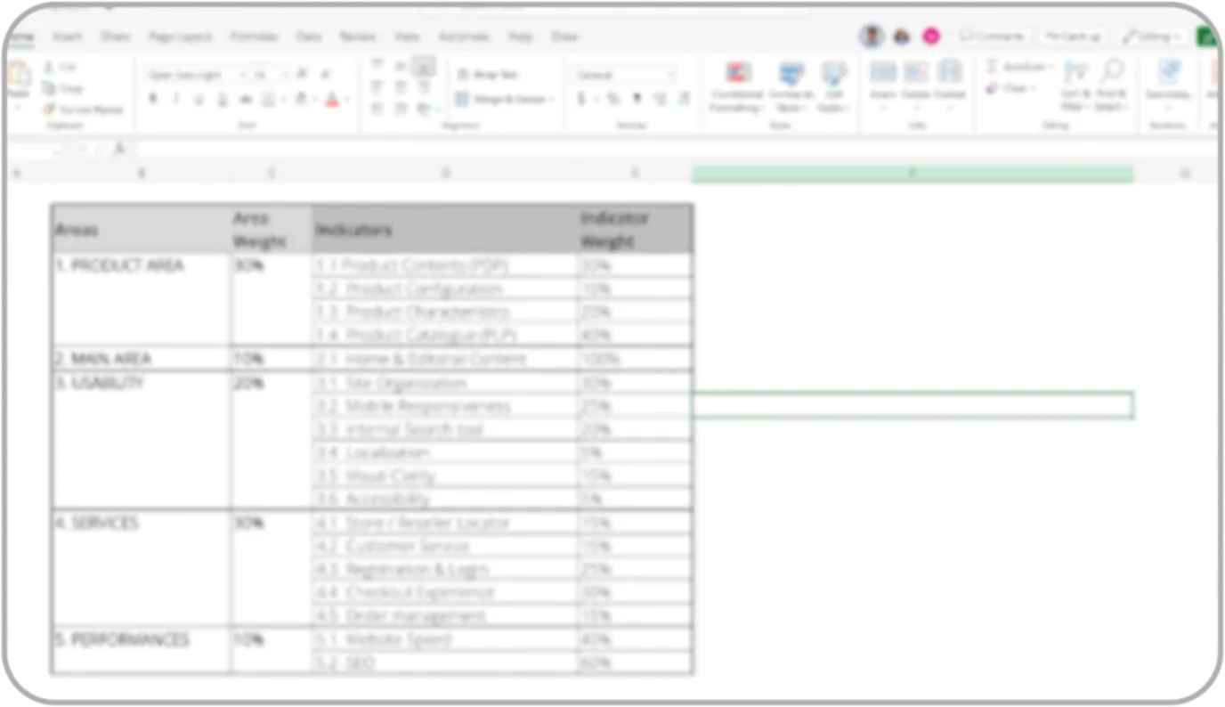
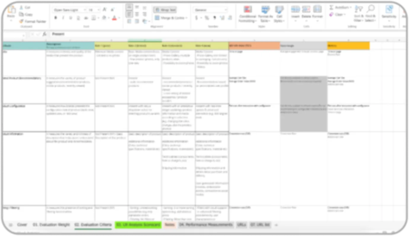
Framework of evaluation. Blurred
to protect client material; the scale
of the process is the point.
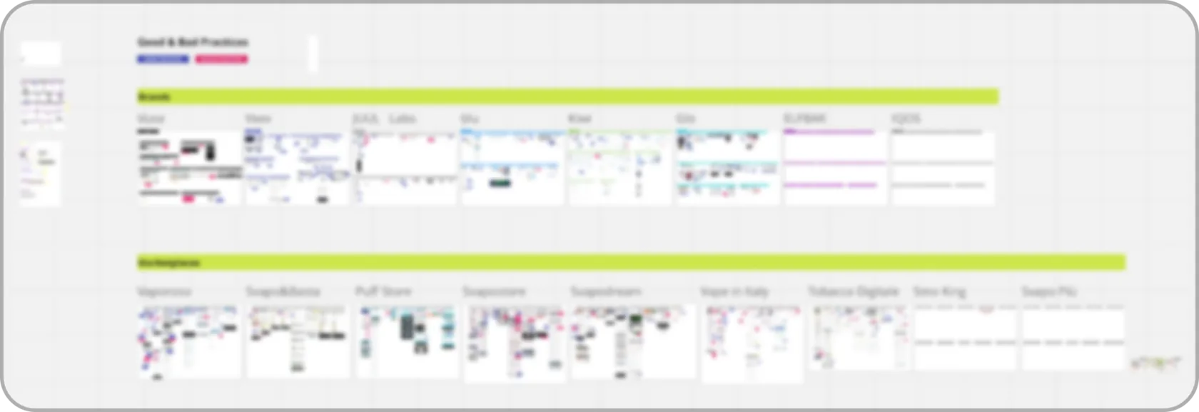
Color-coded benchmarking analysis
of the successful and failed practices.
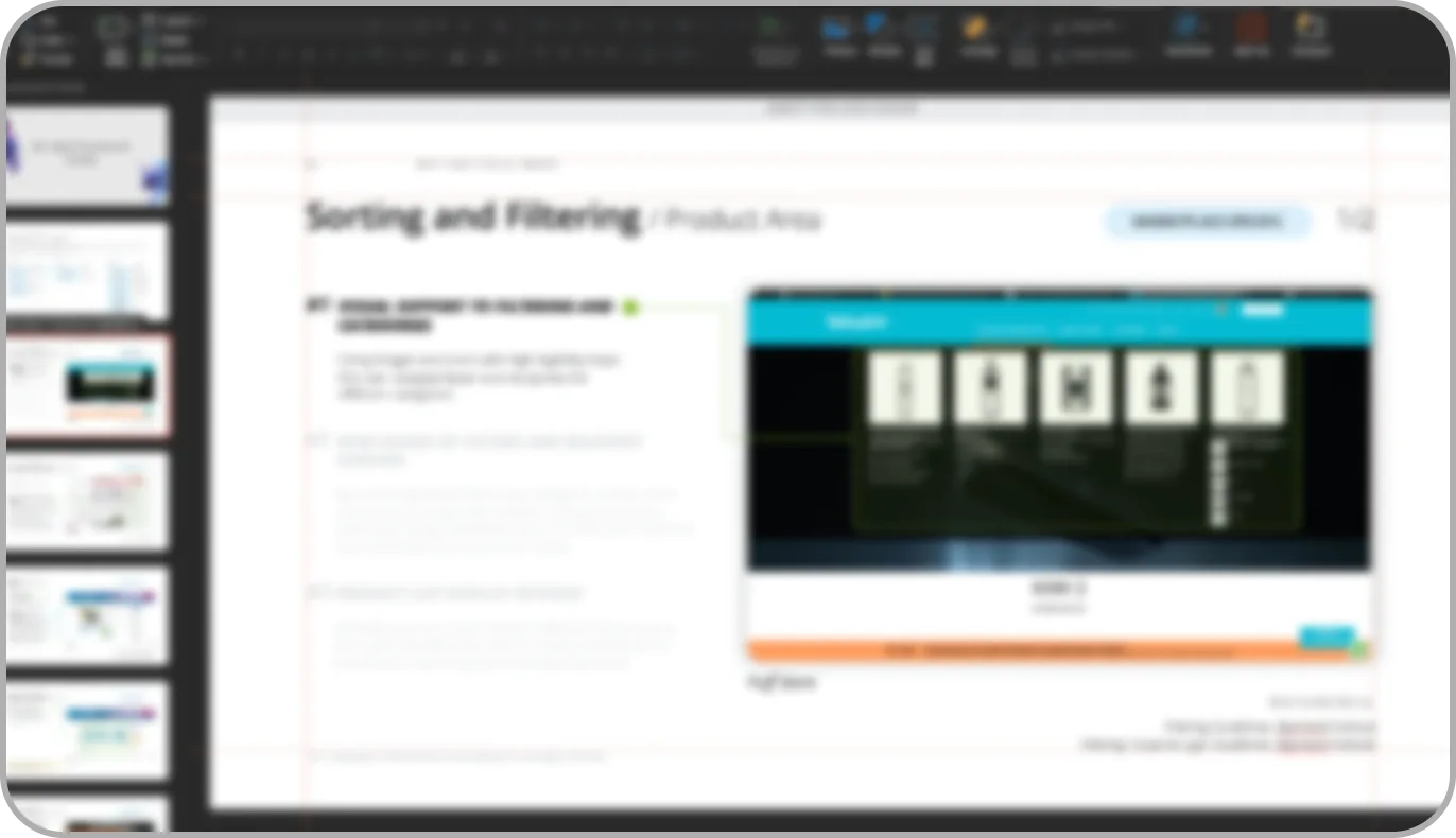
Best-practice slides from the analysis – each
practice illustrated, explained, and referenced
against Baymard guidelines. Blurred to protect
client material.
4 / WHAT HAPPENED
The final output wasn't a redesign. It was a decision-making
tool: recommendations for each pain-point cluster, grounded
in the benchmarking evidence and the Baymard references,
prioritised into quick wins and structural changes, with a KPI
framework to measure them against. The client didn't buy
screens. They bought certainty about what to fix first.
Also in the six months
Insurance app
Onboarding flow for a client's insurance app –
four screens that had to explain what the app is
for and carry the company's values
at the same time
Heritage website tender
A two-week pitch: brief analysis, benchmarking
through a tagged visual-research system
I built in Figma, four design principles
derived with the team from the research,
then wireframes and two website drafts
for desktop and mobile. My first experience
of web-design project that had to be defensible
in front of a client in days rather than weeks.
Internal
Redesigned the team's Digital Accessibility (WCAG) course materials and co-developed
a wireframing workshop.
5 / WHAT IT CHANGED
Three things came out of it. Evidence is the deliverable –
the weighted framework, the references, the journey-mapped
clusters were all architecture for justifying decisions,
and everything I have done since is built on that habit.
Process is what makes teams scale: assigned interview
roles, timed scripts, governance phases, none of it
glamorous and all of it the reason five people
can produce one coherent result.
And accessibility is a standard, not a feature — rebuilding
the materials for WCAG course was my introduction to it
as a discipline with rules rather than a sensibility, and it
changed how I design anything informational.