Maramao VintageMarket
A weekly Saturday market holding vintage, craft, vinyl, workshops,
DJ sets, food and Area Kinky under one visual roof. Six named
colours, three typefaces, and a cat.
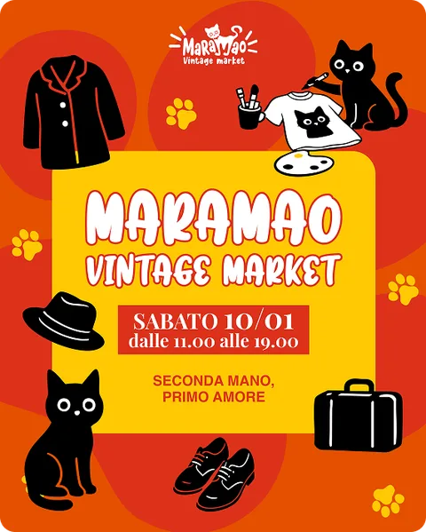
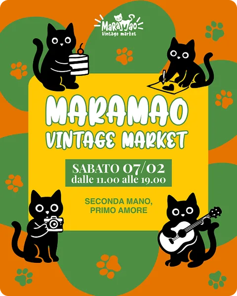
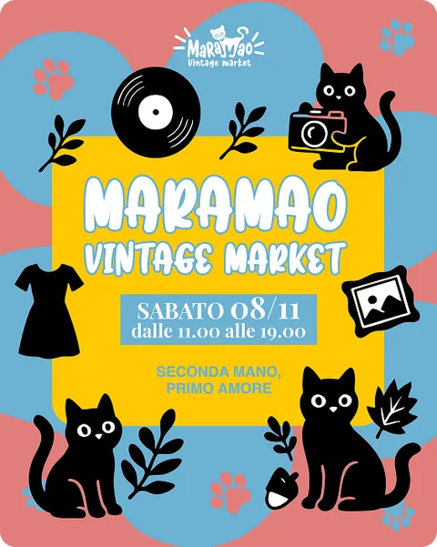
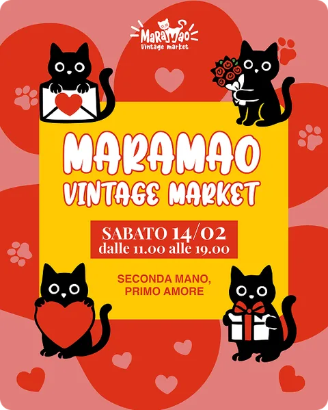
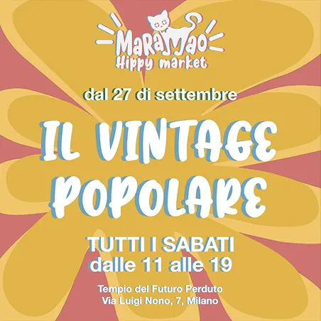
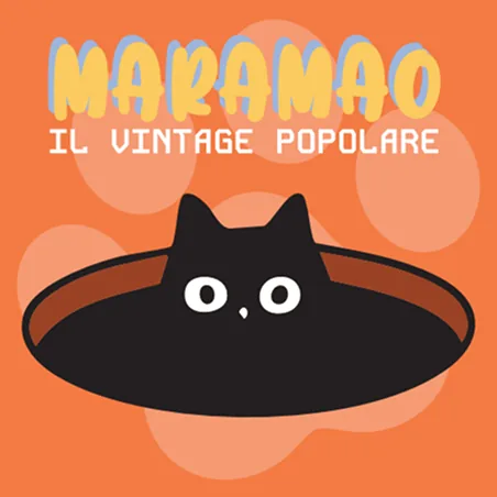
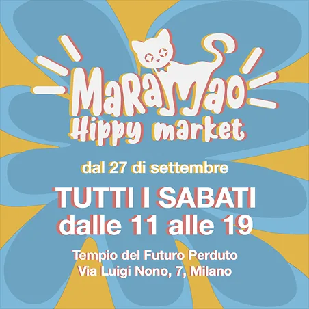
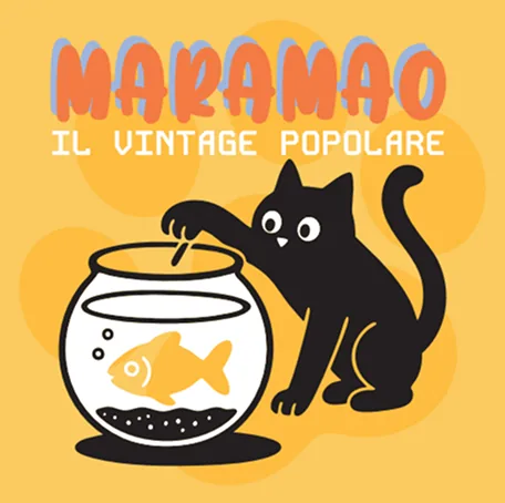
Examples of posts for Instagram
On the AI tools
The illustrations started with ChatGPT as a way to explore styles
and creature variations at speed, then were redrawn
and changed in Illustrator. The AI accelerated the exploration;
the editorial decisions stayed with me.
1 / What it had to do
The market runs every Saturday at Via Luigi Nono 9 and holds
things that do not naturally sit together: vintage clothing
and objects, handmade craft, prints and vinyl, creative
workshops, DJ sets, food, and Area Kinky, the more playful
underground end of it. An identity leaning too minimalist
would erase the variety. One leaning too hard into any single
register would lose all the others.
2 / The idea
Playful maximalism with editorial structure. Fun as a strategic
choice rather than a default: the energy is high and the craft
is controlled. The reference was not the 1960s — it was a designer
working in 2024 who has studied the 1960s properly
and filtered it through a contemporary eye. The identity
is not a fixed object. It is a set of permissions: generous
enough to hold a vintage stall next to Area Kinky next
to a children's craft workshop, structured enough that all
of them still feel like the same Saturday.
3 / How it works
Six named colours, any of which can dominate, so recognition
comes from the constellation rather than one fixed
hue. Three typefaces doing three jobs: Groovy Souls
for the wordmark and big statements, a geometric
techno-leaning face for section dividers and secondary
emphasis, and a neutral body face so detail stays readable
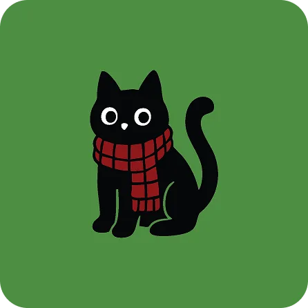
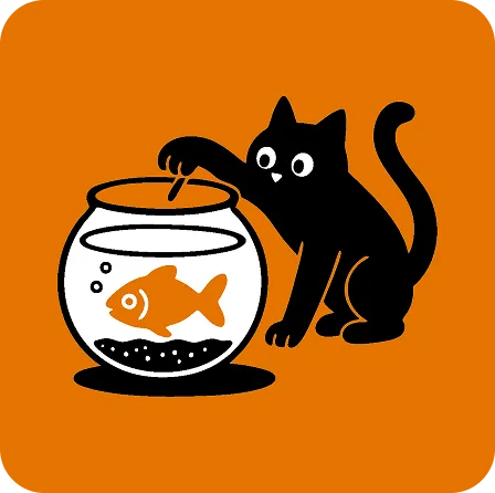
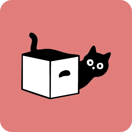
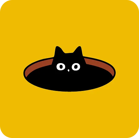
underneath all of it. The illustration system is built around
a cat, with paw prints and small seasonal elements marking
what is on at the market. The logo was revised mid-project:
the descriptor moved from “Hippy market” to “Vintage”
for clarity, and the cursive secondary font was
replaced with a bolder print face that survives being small.
The website carries the same system across desktop and
mobile in Italian and English, with five illustrated category
icons over the coloured grounds. The structure stays calm;
the surface stays loud.
- Research + moodboard
- Logo redesign
- Three typefaces + color palette
- Cat illustration system
- Print · stickers · tote
- Bilingual site, IT + EN
Logo redesign
The logo was revised mid-project: the descriptor moved
from “Hippy market” to “Vintage” for clarity,
and the cursive secondary font was replaced with a bolder
print face that survives being small.
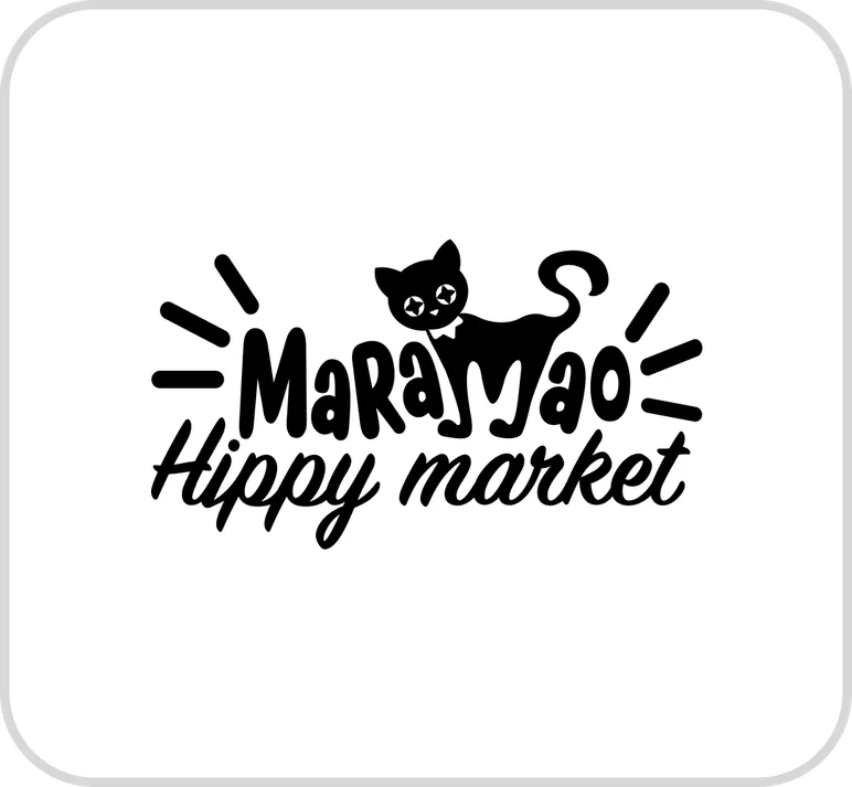
Logotype before redesign
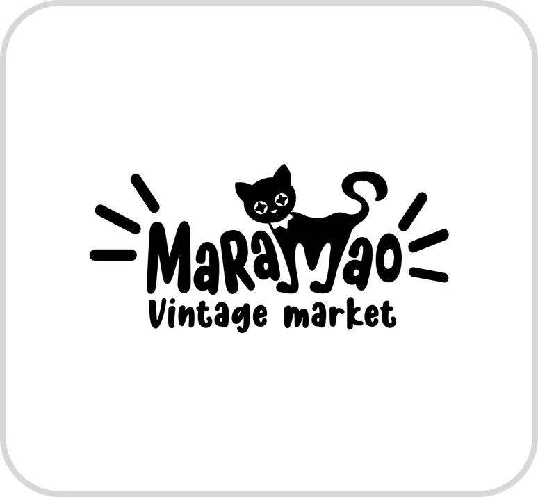
Logotype after redesign
Color palette
and fonts system
#99B7F5
Vintage Sky Blue
Openness, daytime,
the dominant ground for cover
applications. Reads warm
despite being blue – the slight
purple undertone keeps it
from going corporate.
#E17E7A
Bubblegum
Nostalgia, warmth, playfulness,
the softness of the market.
#4E8E43
Garden
A deep, saturated green
closer to forest than to lime. The vegetation color
in the illustration system. Darker and more grounded
than the other colors.
#E47400
Market Orange
Burnt tangerine, the most
often use color in the system. Dominant. The color that reads
most loudly from a distance –
on a market stall, a social post,
a pasted poster.
#DC3619
Energetic Red
The intense red color is
the most energetic out of all
color palette. Adds the spirit
of creation, creativity
and action.
#EFBB01
Summer Evening
The most golden of the palette. Energy, light, presence. The header ground
for the typography system
page – it belongs
to the loudest moments.
Three typefaces doing three jobs: Groovy Souls
for the wordmark and big statements, a geometric
techno-leaning face for section dividers and secondary
emphasis, and a neutral body face so detail stays
readable underneath all of it.
HEADINGS
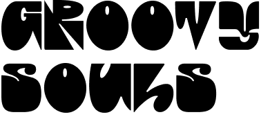
Mood: Playful, retro,
psychedelic.
Associations: 1970s posters,
hippie festivals, freedom,
creativity.
Use: Eye-catching titles,
big statements, brand-
defining visuals.
SUBHEADINGS

Mood: Futuristic, geometric,
digital but still funky.
Associations: Techno,
underground culture,
alternative edge.
Use: Section dividers, secondary
emphasis, to balance
the softness of Groovy Souls.
MAIN TEXT

Mood: Neutral, modern,
timeless, clear.
Associations: Professionalism,
universality, clean, easy
readability.
Use: Body text, detailed
descriptions, keeping
the message accessible.
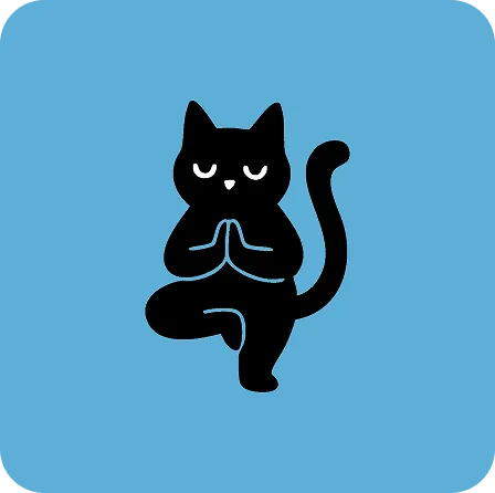
Illustration system
The illustration system is built around a cat, with paw
prints and small seasonal elements marking what is
on at the market.
WEBSITE
The website carries the same system across desktop
and mobile in Italian and English, with five illustrated
category icons over the coloured grounds.
The structure stays calm; the surface stays loud.
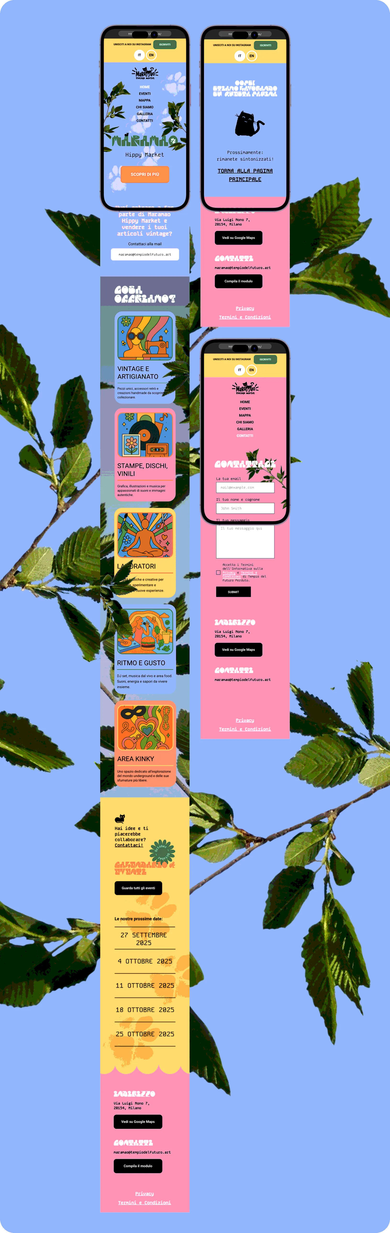
Mobile version of the website
PRINT MATERIALS
As addition to the digital system the print materials
were developed - stickers and tote-bag.
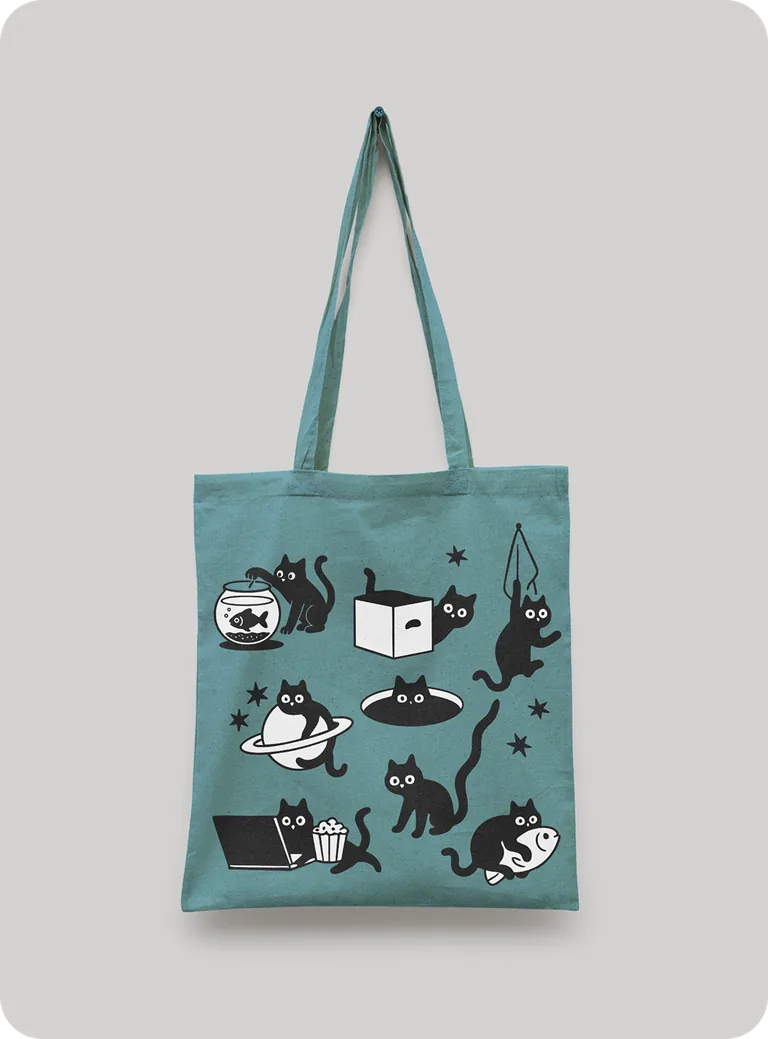
Tote bag for Maramao Vintage Market. Blue shade reminds the color that
was unsaturated on sun.
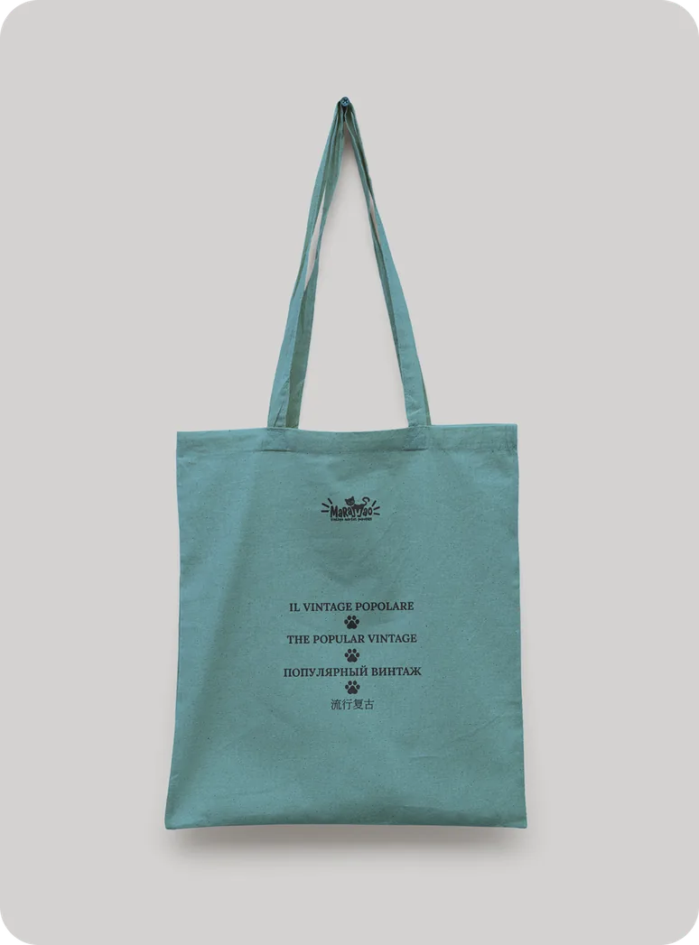
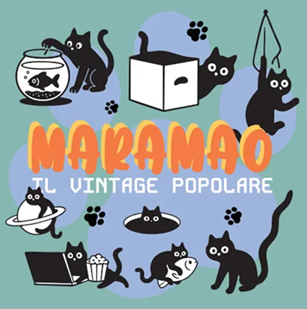
Stickers with changed fonts
4 / What HAPPENED
Running weekly at Via Luigi Nono 9, with the site live in Italian
and English. Delivered: identity, redrawn logo, illustration system,
colour and type systems, the bilingual site, stickers, a tote bag
and social templates.