Oriental TechnoClub website
Italy's first recurring party dedicated to electronic music and arts
from Asia. A website built from archival research — ancient Chinese
books, woodblock prints, folk illustration — rather than from what
other club sites look like.
1 / What it had to do
OTC is the first recurring party in Italy entirely dedicated
to electronic music and arts from Asia. What began as occasional
events now has a permanent home every Friday at China Town,
Milan. It needed a digital home that matched the project's actual
identity: serious about the music, specific about the cultural reference,
and distinct from generic European techno aesthetics. The brief
was to treat Asian visual culture as primary research, not as decoration
layered on top of a standard club template.
2 / The idea
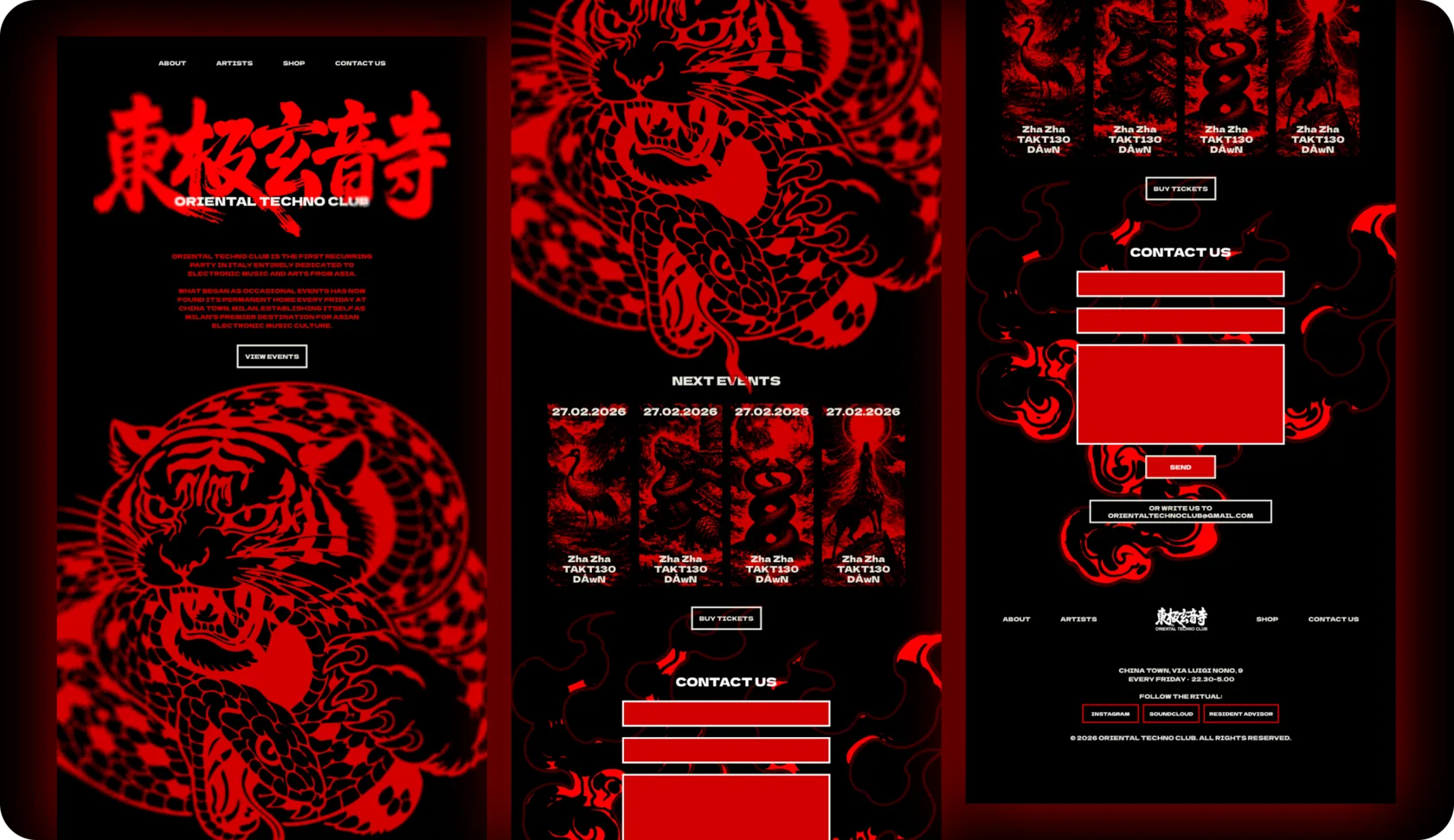
One test decided everything. Strip the text, show the screenshots
to someone who knows nothing about the club: would they
understand from the visual language alone that this is specifically
about Asian electronic music culture? Not “dark techno club”,
not “underground Milan”, but that exact intersection.
So the research went to primary archival material — scans
of ancient Chinese books, woodblock prints, folk illustrations —
instead of contemporary “Asian-aesthetic” references. What came
back was grain, broken ink edges and mineral-red overprints
on aged paper. That physical quality, the evidence that something
really was printed centuries ago, became the texture of the project.
3 / How it works
Archival grain inside contemporary minimalism: generous black
space and modern typographic hierarchies, with high-contrast
woodblock-derived imagery placed precisely inside them.
One typeface carries the whole system — Dela Gothic One,
chosen as a deliberate contrast to the primal, organic creatures,
its heavy brutalist letterforms drawn from modern street-style
Chinese posters. The site is a single long-scroll page in five
sections (hero, events, contact, social, footer) with Artists
and Shop the only sub-pages in the navigation, because
OTC is not a brand with complex content needs. It is a club night
with a recurring listing, a booking email and social links. The work
was making someone who scrolls once feel like they entered
a specific world rather than read a venue page.
- Archival scans
- Woodblock research
- One typeface, three values
- Long-scroll build
- Scroll animation
- Particle cursor
Three values
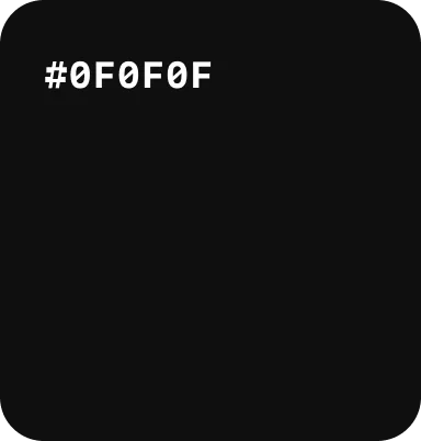
Near-black
The ground. Generous black space is what lets the woodblock imagery read at high contrast.
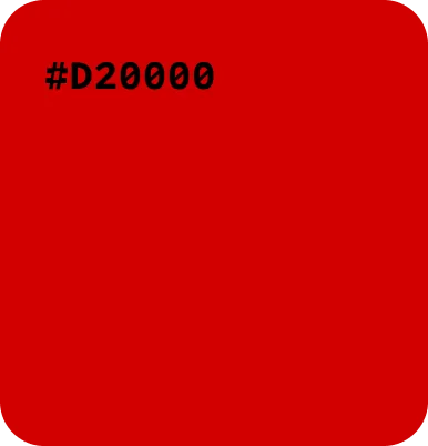
Mineral red
Brighter and more saturated than the ink red used on the design side of my work — electric and
club-coded rather than editorial. Red and black here is culturally specific, rooted in Chinese amulet, lantern and folk-graphic tradition.
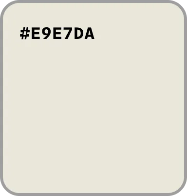
Cream white
The paper value.
Six decisions
that made it OTC
01
The Chinese title takes the logo position
東極玄音寺 sits where a Western site puts
the logo — above the English wordmark, at full
display scale. Structural, not decorative.
02
Tiger and snake at screen scale
The red woodblock tiger fills the hero.
Too large to be a logo element, too specific
to be decoration. It works closer to a poster,
or a flag.
03
Artist cards as amulets
Vertical proportions taken from Chinese paper
amulets: long narrow format, red ornamental
framing, vertical typographic logic.
04
Follow the ritual
“Follow us” became “Follow the ritual”. One
swap that moves the visitor from consumer
to participant.
05
Folklore that moves
A scroll-triggered animation walks
the creature across the screen as you
go down the page.
06
The cursor burns
The cursor emits red, ember-like particles,
leaving a continuous trail of fire behind it.
None of these are decoration. Each one is the cultural-specificity
test applied to a particular part of the page.
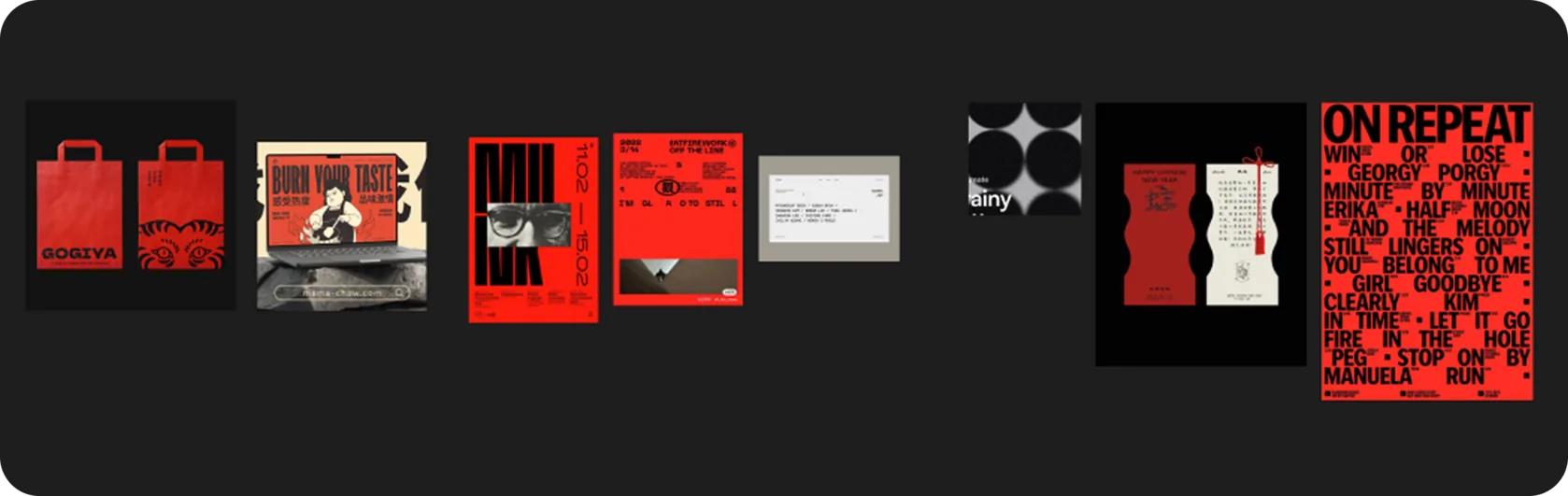
Moodboard in Figma
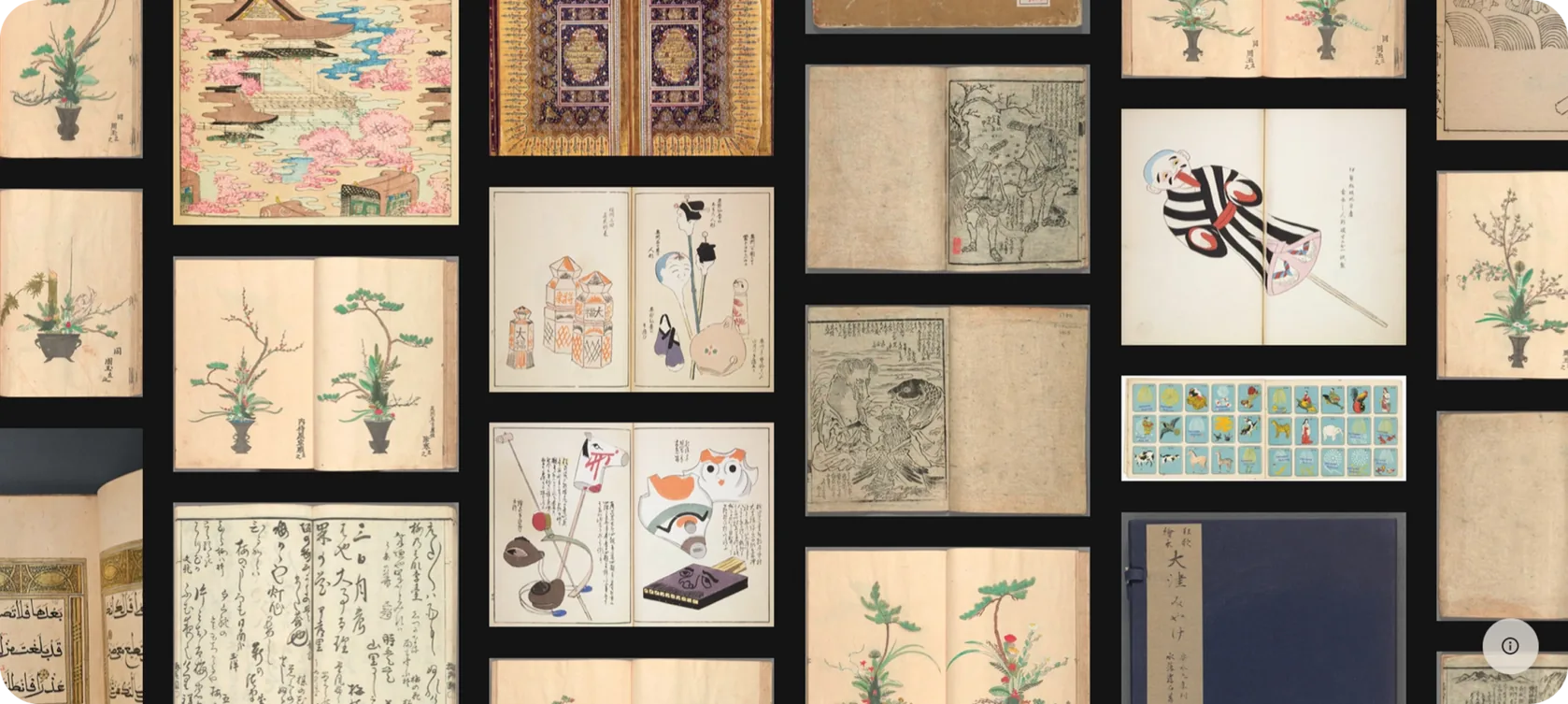
Scans of the ancient chinese books
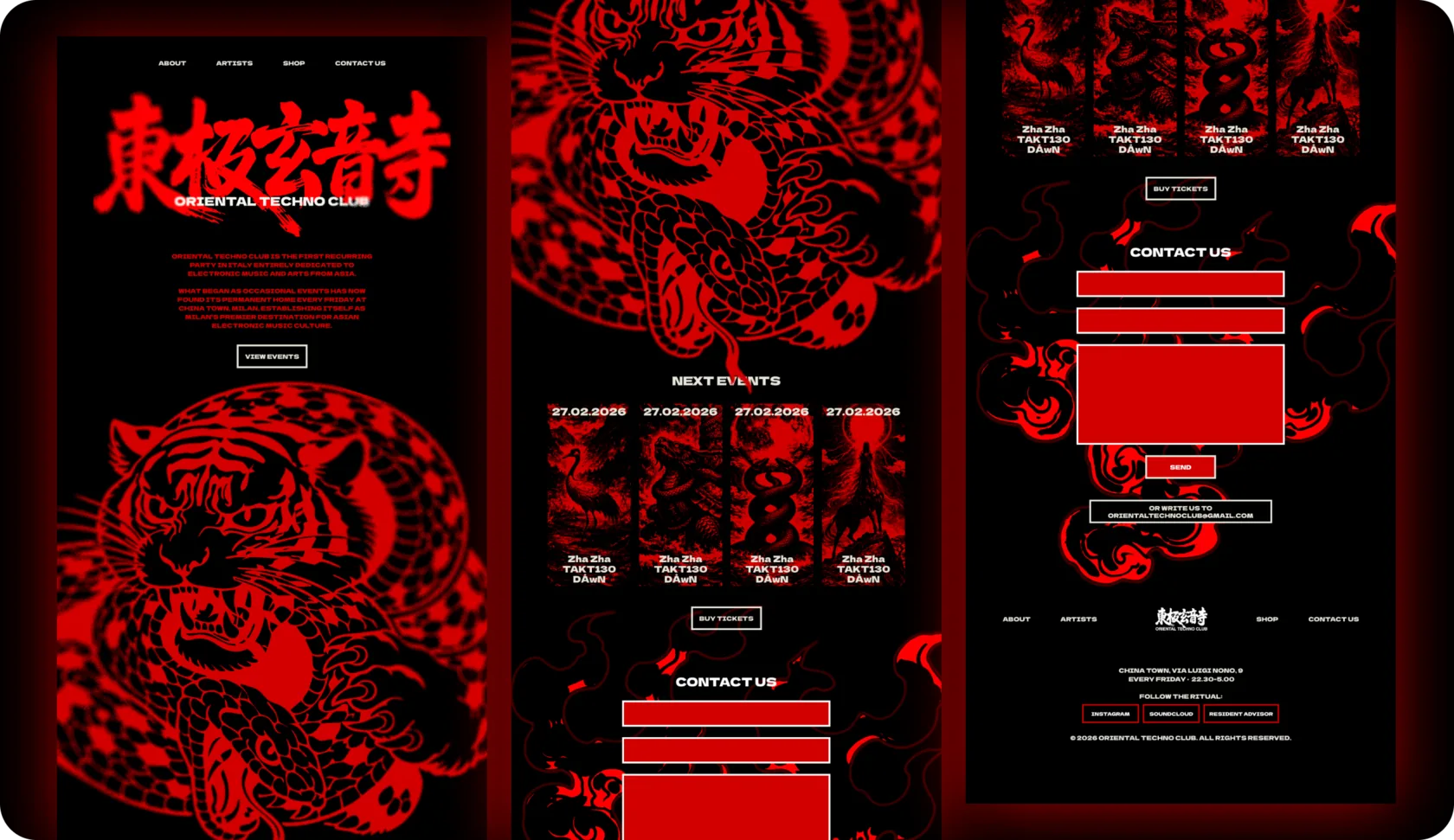
Oriental Techno Club – home page overview
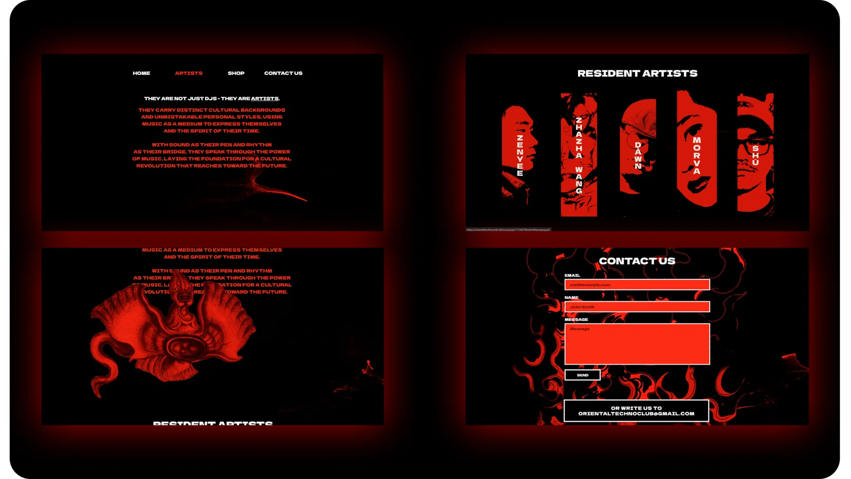
Oriental Techno Club – artists page overview
4 / What happened
Running every Friday at China Town, Milan. Editions since
the Friday residency started, audience size, and anything that came
back — press, bookings, a second scope. I also started to develop
and perform visuals live – together with projection mapping.
About this – project on the page "Live".