Tempio di Bacco
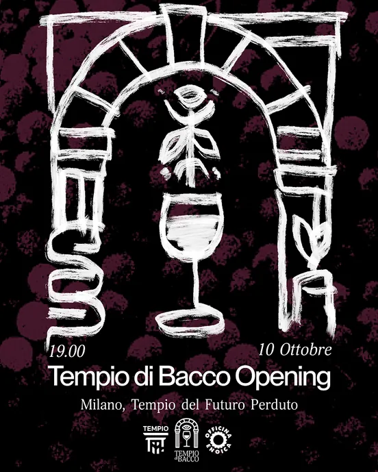
Monthly natural wine fair. Composed frames, imperfect contents —
classical layouts holding loose hand-drawn illustration.
10 editions from one system.
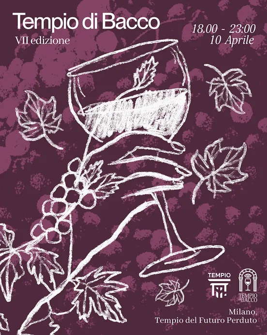
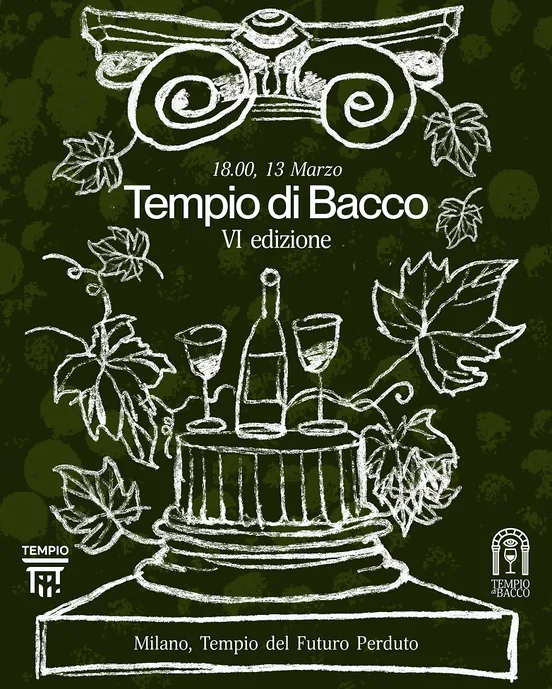
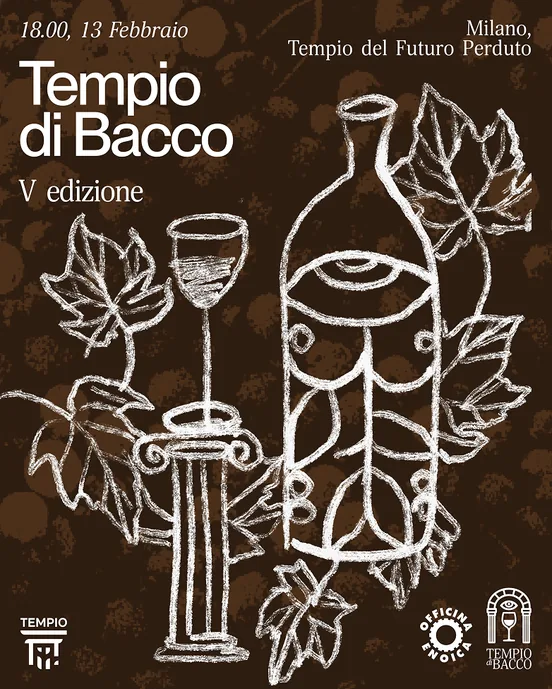
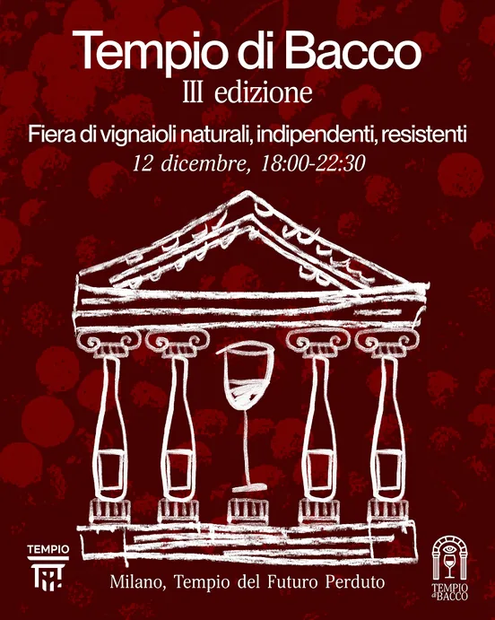
1 / What it had to do
The brief contained a productive contradiction:
build an identity that carries the hand-made,
agricultural character of natural wine, while holding
the elegance and depth of wine culture itself.
Natural wine sits between two worlds. It's artisanal,
unfiltered, made by small independent producers
who reject industrial perfection – but it's also part
of a centuries - old cultural tradition with its own
codes, rituals, and seriousness.
An identity that leaned too far into rustic would lose
the cultural weight. One that leaned too far into elegance
would betray the spirit of the wine itself.
The work was to hold both at once.
2 / The idea
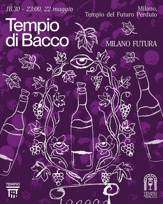
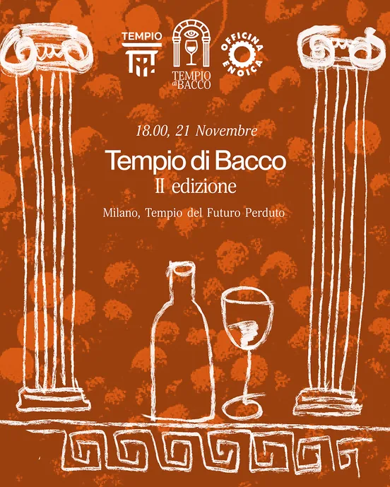
Composed frames, imperfect contents. The structure
is classical – centred, symmetrical, the kind of layout
a wine label has used for two hundred years — and
everything inside it is drawn loosely by hand. The tension
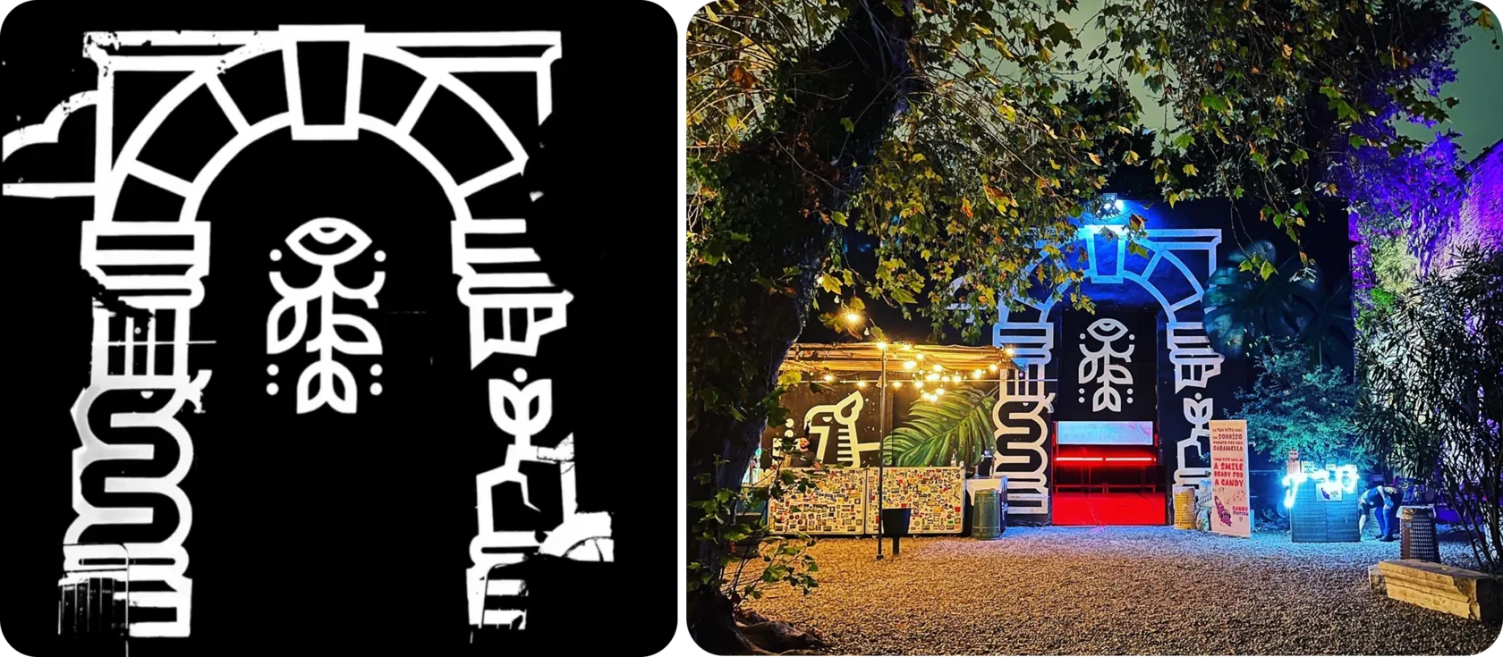
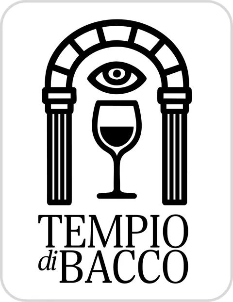
between the two is the identity. The logo redraws
the venue's own Romanesque facade, so the mark
is the building rather than a wine reference.
3 / How it works
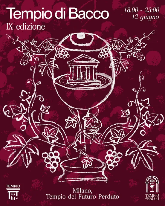
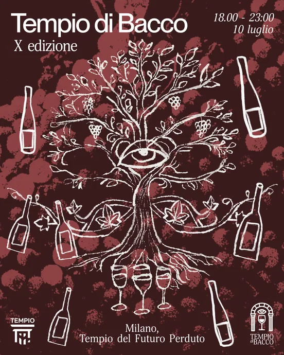
One frame, one type pairing, one illustration style,
and a colour that changes per edition. Everything
else stays fixed. That is what makes nine editions
read as one thing while still being worth looking
at each month — the recognition lives in the structure,
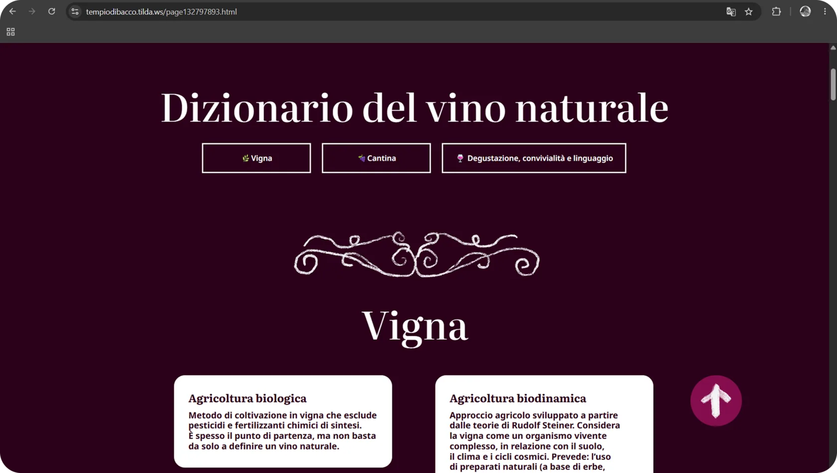
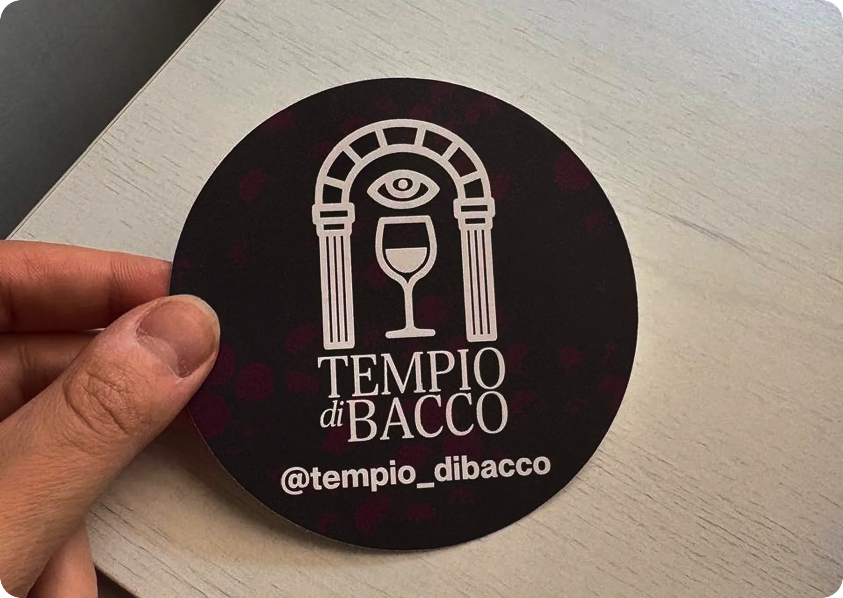
and the novelty lives in the drawing. Print, social and web
are the same layout at three widths.
- Facade → logo
- Frame system
- Monthly illustration
- Color selection
- Print / social
- Website